Website Design
Project Overview
When I started redesigning my website, I had two clear goals: first, to show the breadth of my work without overwhelming people, and second, to make my personality and story visible instead of hiding behind just project thumbnails. The site needed to speak to design recruiters, collaborators, and curious friends at the same time, which meant balancing professionalism with an informal, conversational tone.
Problem & Objectives
I set three core objectives for the redesign:
-
Make my transition from architect to UX designer obvious within a few seconds of landing on the site.
-
Create clear paths into architecture, UX projects, content creation, and personal writing without the homepage feeling cluttered.
-
Make the site feel like “me” by using copy, structure, and visuals that reflect how I talk, think and work.
These objectives became my filters, any section, label or filter that did not fit them was either simplified or renewed.

Information Architecture and Navigation
I started by mapping everything I do—architecture, interior design, competitions, 3D visualization, UX projects, photography, podcasting, content creation, blogs, and my CV. The risk was obvious: without structure, this could easily feel like a chaotic “jack of all trades” dump rather than a focused portfolio.
To solve this, I grouped content into a few all-encompassing clusters: spatial/architecture work, digital/UX work, content and podcast, and personal writing. This allowed the navigation to stay relatively lean while letting each cluster go deeper in its own page where needed.
Initial Sketches & Ideation
Navigation and Flows
As the website sits somewhere between portfolio and personal hub, I designed flows that respect different entry motivations. A recruiter might jump quickly from the homepage to UX/architecture work and then to the CV, while a friend or potential podcast guest might move from the homepage to the podcast, blog, or personal section.
Key flows I focused on:
-
Portfolio-first path: Home → Architecture / Spatial UX → UX or professional projects → CV.
-
Personality-first path: Home → About → Podcast / Blog → Personal page.
Designing for these flows influenced how I labeled sections and how often I cross-linked between pages, so people don’t feel “stuck” in one silo of content.
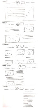
Low Fidelity Wireframes
Visual Direction and Hierarchy
Visually, I aimed for a layout that feels more like a calm framework than a loud visual statement, so the work and writing can breathe. Each page leans on clear headings, logical grouping, and enough negative space to keep long-scroll experiences from feeling heavy, especially in content-heavy sections like the blog and portfolio indexes.
I also treated thumbnails, images, and text blocks as equal partners: images show craft and atmosphere, while the accompanying copy explains decisions, constraints, and outcomes. This is particularly important for architecture and spatial projects, where visuals are strong but context is essential.
Mid Fidelity Wireframes
Visual and interaction language
The visual system leans on clean layouts and generous white space so that drawings, renders, and interface screenshots can stand on their own. Color and typography are kept minimal and consistent, allowing the work to be the most expressive element while still reflecting my preference for structured, editorial-style layouts from his magazine design background.
Interactions are designed to feel straightforward and unobtrusive:
-
Clear, predictable hover states and transitions keep attention on the content rather than the UI.
-
Scrolling is used as the primary interaction, with each page composed as a vertical narrative that reveals context, process, and outcomes in sequence.
Style

High Fidelity Wireframes
Positioning and Outcome
Overall, this website is designed as a living, evolving document of my journey from architect to multidisciplinary designer, not a static end product. It allows me to house architecture, UX, content, podcasts, and personal reflections in one place without apologizing for the range, and instead framing that range as the core of my practice.
Every page, label, and paragraph exists to help someone understand how I think: analytically because of architecture, empathetically because of UX, and curiously because of the conversations and content I keep creating
Congrats, you made it to the end! If you’re craving more excitement, just scroll your way back to the top and try a different page because this one is officially out of content.


