
Magazine Design
Daniel Libeskind: Designing Emotion in Structures - A Magazine Feature
I’ve always believed architecture is more than concrete and steel—it’s a little bit dream, a little bit story, and (if Libeskind has anything to say about it) definitely a lot of drama. For the Design Through The Decades Journal, my feature on Daniel Libeskind explores how his career pivots on invoking feeling and culture, making buildings that do everything but blend into the background.
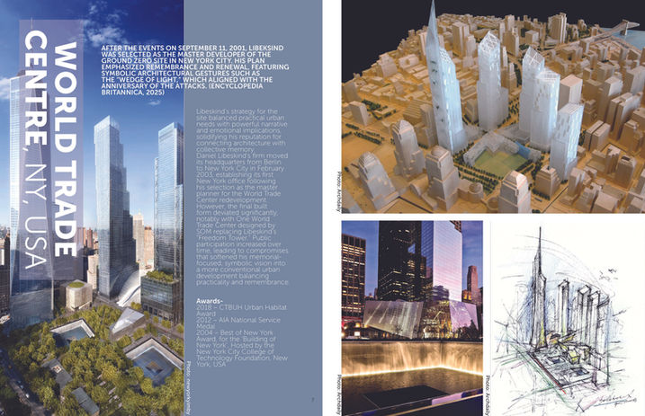
From the zigzagged floors of Berlin’s Jewish Museum to New York’s World Trade Center redevelopment, Libeskind’s work is proof you can sketch emotions onto city skylines. Just ask the locals who’ve gotten lost in his abstract hallways (and perhaps, in existential reflection).
In this multi-page spread, I mapped his journey from accordion player to architectural provocateur. The magazine weaves together sharp project highlights (think dramatic angles and titanium panels), glimpses into the deconstructivist mind, and the occasional literary nod.
As editor and designer, I balanced grids, type scales, and lots of beautiful chaos. Each spread guides readers through the evolution of Libeskind’s philosophy: architecture not as mute background, but as a voice, sometimes distorted, always impactful.

Magazine article
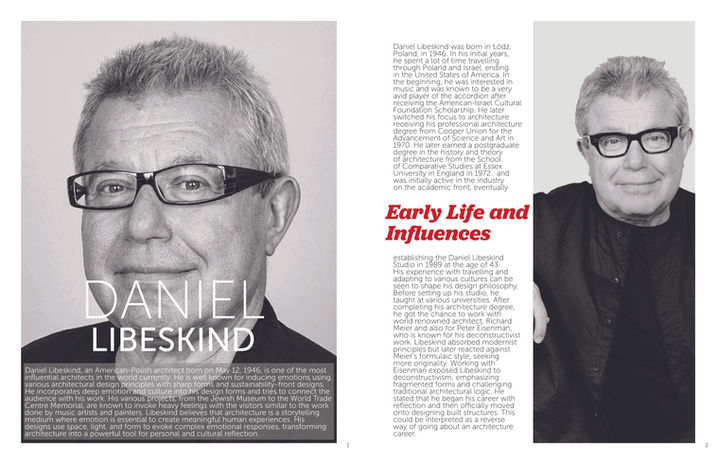
For this project, I selected architect Daniel Libeskind for an in-depth, research-driven magazine feature. I selected Daniel Libeskind as he was a crucial influence on my architecture thesis for my undergraduate course.
My article explores Libeskind’s background, philosophy, and signature works—analyzing how his sharp forms and emotional storytelling have shaped contemporary architecture. Through educational research and visuals, I discussed his historic significance, influences, and impact on both the design world and wider cultural narratives.
Magazine front pages
For my magazine cover lab, I created professional front and back covers for the “Design Through The Decades” journal, starring Daniel Libeskind’s dramatic architecture. Each cover variation uses a unique grid system, my own custom typographic logo, and a clear hierarchy—covering everything from bold headers to body copy. The front spotlights Libeskind’s work and sets the brand tone, while the back features my academic contribution statement, properly formatted mailing details, and contact info as required. Every version reflects discipline in grid layout, consistent visual language, and the same imagery and brand elements, all tailored for editorial standards—just as the assignment demanded.


